ShopDreamUp AI ArtDreamUp
Deviation Actions


Comments16
Join the community to add your comment. Already a deviant? Log In
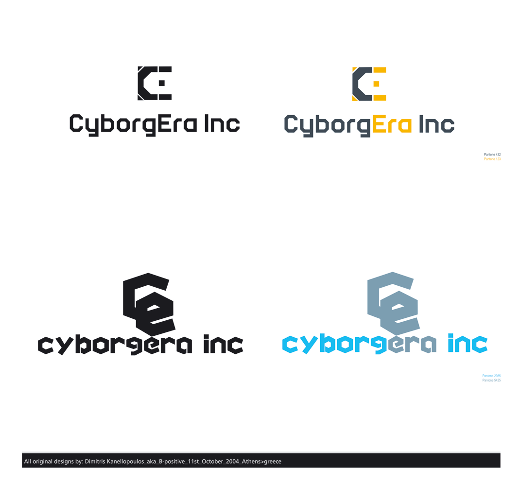
The top 2 are stronger. For the bottom 2, the "CE" looks off center. I see what you were going for, but i think it would look more balanced if you center it and put some space between it and the type. there are some diagonal lines that look like they need to be parallel, but are at an angle.